The friendliest place on the web for anyone with an interest in aquariums or fish keeping!
If you have answers, please help by responding to the unanswered posts.
I like the new look. Its easy to navigate, and highlights some good info on the home page. The only drawback to me is the time it takes to load each page when reading the forum. But I usually do that on my ipad which is still as quick as ever.
A while back I complained about the delay in loading each page. That was using Firefox as a browser. I started using Google's Chrome, and it's fast as a bullet. No more complaints.
A while back I complained about the delay in loading each page. That was using Firefox as a browser. I started using Google's Chrome, and it's fast as a bullet. No more complaints.
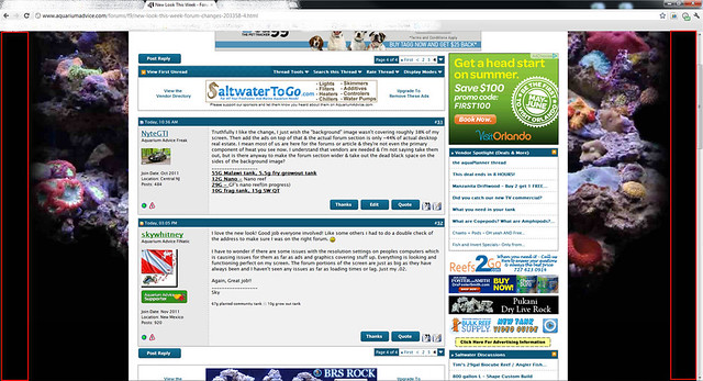
I think it looks like a picture that was made for 800 x 600. it looks like watching non widescreen movies on a widescreen & you get those 2 black bars.
here's what i'm talknig about:
if you took those 2 black bars(highlited in red boxes) out & made the forum that much wider it would look 10x better.
You can turn off the right ad bar which would expand the discussions to the right. Just go to User CP>Edit Options and all the way at the bottom, the last option is:
"Turn off Right Column
If you would like to turn off the right column on our site please set this to Off "
")